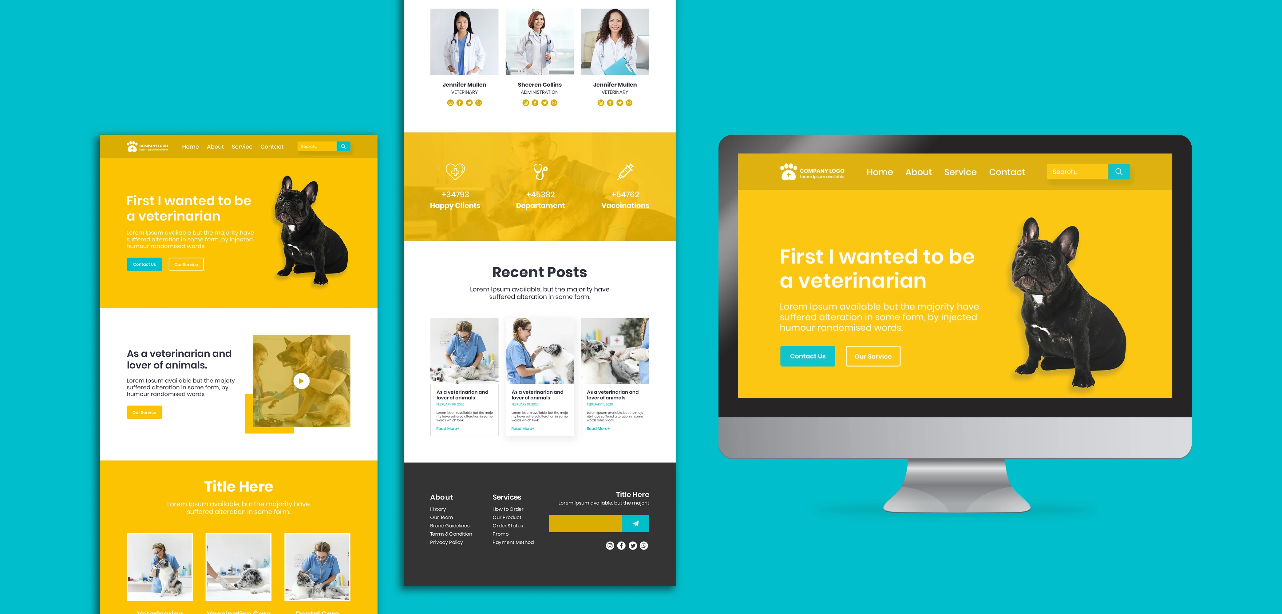
Yellow Color Schemes That Energize Your Design Palette with Vibrant Combinations
Yellow color schemes are vibrant and evoke feelings of warmth, optimism, and energy. Yellow color can brighten any design, making it an excellent choice for a wide range of applications., from branding to web design. In this article, we’ll explore color schemes for yellow, examining its tone and mood, its benefits across different industries, and how to create effective yellow color palettes. We’ll also delve into case studies showcasing how brands have successfully utilized yellow in their marketing strategies.
Understanding the Tone and Mood of Yellow
The Emotional Impact of Yellow
Yellow is often associated with positivity and happiness. It reflects sunlight, suggesting warmth and cheerfulness. This color can evoke feelings of joy, energy, and inspiration, making it a powerful tool in design. However, the tone and mood of yellow can vary significantly depending on its shade and the colors it’s paired with.
- Bright Yellow: Bright yellow is energetic and attention-grabbing, often used in designs aimed at children or to evoke excitement. Its high visibility makes it effective for capturing attention, which is why it’s commonly used in advertising and promotional materials. Brands that target a younger audience, such as toy manufacturers or entertainment companies, frequently use bright yellow to create an inviting and playful atmosphere.
- Pastel Yellow: Softer shades convey a sense of calmness and tranquility, often associated with spring and renewal. Pastel yellows are gentle on the eyes and evoke a sense of comfort and peace. These shades are often used in designs for baby products, wellness brands, and organizations focused on mental health, as they promote a soothing and comforting environment.
- Mustard Yellow: A more muted tone, mustard yellow exudes sophistication and warmth, making it suitable for more mature designs. This shade can add depth and richness to a palette and is often seen in fashion, interior design, and gourmet food branding. It conveys a sense of vintage charm and is frequently used by brands looking to establish a connection to tradition or craftsmanship.
The Psychology of Yellow
The psychological effects of yellow extend beyond just the emotions it evokes. Studies show that yellow can stimulate mental activity and enhance communication, making it an excellent choice for educational materials and platforms. It can also promote feelings of optimism and creativity, encouraging innovative thinking.
However, it’s important to note that too much yellow can lead to feelings of anxiety or agitation. This is why it’s crucial to balance yellow with complementary colors to maintain a harmonious design.
How Different Industries Use Yellow for Their Benefit
1. Food and Beverage Industry
Yellow is widely used in the food industry to stimulate appetite. Brands like McDonald's and Subway utilize yellow in their logos and packaging to create a sense of warmth and approachability. The color is inviting and encourages customers to feel comfortable and welcome.
- Psychological Effect: Yellow can trigger feelings of hunger and excitement, making it an ideal choice for food branding. The color is associated with freshness and liveliness, which are essential attributes for food-related businesses.
- Practical Application: In restaurant interiors, yellow is often used for walls and décor to create a lively atmosphere that encourages social interaction and enjoyment.
2. Travel and Tourism
Many travel companies incorporate yellow in their branding to evoke feelings of happiness and adventure. For example, Airbnb uses yellow in its marketing materials to promote a sense of exploration and joy in travel experiences.
- Emotional Connection: Yellow can evoke memories of sunny vacations and joyful experiences, making it a powerful tool for brands in the travel sector.
- Visual Appeal: Bright yellow imagery in travel advertisements can capture attention and inspire wanderlust, encouraging potential travelers to consider new destinations.
3. Retail Industry
Yellow is often employed in retail environments to draw attention to sales or promotions. It’s a color that stands out, making it effective for signage and advertisements.
 Designed by Freepik
- Attention-Grabbing: Retailers frequently use yellow for clearance signs or promotional banners to create urgency and compel customers to act quickly.I hope now you have understood why yellow color is attention grabbing. If you have not then look at the above image. I know your eyes are going to the yellow objects automatically, well that is what i wanted to explain.
- Brand Identity: Brands like Best Buy use yellow strategically in their branding to reinforce their identity as approachable and customer-friendly.
4. Technology Sector
Tech brands like Snapchat use yellow to convey innovation and friendliness. The bright hue can make technology feel more accessible and engaging.
- User Engagement: Yellow creates a sense of familiarity and playfulness, encouraging users to explore the brand's offerings without feeling intimidated by complex technology.
- Brand Differentiation: By utilizing yellow, tech companies can differentiate themselves in a market often dominated by cooler colors like blue and gray.
5. Fashion Industry
In fashion, yellow can signify confidence and boldness. Brands often use yellow to make a statement, drawing attention to specific items or collections.
- Trendsetting: Yellow is frequently used in fashion marketing campaigns to signify the arrival of new collections, particularly during spring and summer when brighter colors are more popular.
- Consumer Attraction: Yellow clothing or accessories can draw attention, making them perfect for runway shows and promotional events.
Color Palettes of Yellow: How Brands Utilize Yellow Color Palettes
Creating effective color palettes for yellow involves understanding which colors complement it and how they can be combined to achieve the desired effect.
What colors go well with yellow?
When considering which color suits with yellow, several combinations can create striking designs:
- Yellow and Black: This classic combination is bold and high-contrast, making it perfect for attracting attention. Many brands, such as Black & Decker, use this palette to convey strength and reliability. The stark contrast between yellow and black creates an impactful visual that is hard to miss.
- Yellow and Gray: This pairing offers a modern and sophisticated look. Yellow adds a pop of brightness against the calm and neutral gray, making it suitable for tech and lifestyle brands. Gray serves as a stabilizing element that balances the vibrancy of yellow.
- Yellow and Blue: Complementary colors on the color wheel, yellow and blue create a vibrant and energetic palette. Brands like IKEA use this combination to promote a sense of playfulness. The contrast between these colors can evoke feelings of happiness and serenity.
- Yellow and Green: This combination evokes feelings of freshness and vitality. It’s often used in eco-friendly brands, such as Whole Foods, to promote health and sustainability. The pairing suggests growth and renewal, aligning well with brands focused on nature and environmental consciousness.
Color Combinations for Yellow: Exploring Options
Creating a yellow color palette involves not just pairing it with other colors but also considering different shades of yellow itself. Here are a few palettes to inspire you:
Yellow Color Families
- Bright Yellow Palette: Includes shades like lemon yellow, sunflower yellow, and canary yellow.
- Soft Yellow Palette: Features pastel yellows, butter yellow, and creamy yellow.
- Rich Yellow Palette: Incorporates deep yellows, golds, and mustard shades.
Yellow Color Families
Yellow Color Palettes in Social Media and Websites
The use of yellow color schemes in social media and web design can significantly influence user experience. Bright yellow hues can draw attention to key messages or calls to action.
 Designed by Freepik
Social Media
Brands like Snapchat and Bumble effectively utilize yellow in their social media presence. The color makes their posts stand out in crowded feeds, encouraging engagement and interaction.
- Highlighting Key Content: Yellow can be used to emphasize important announcements or promotions, making them more noticeable to followers. For example, using yellow backgrounds for promotional posts can create a sense of urgency and attract clicks.
- Creating a Recognizable Identity: Consistently using yellow in social media graphics helps establish a brand's visual identity, making it easily recognizable among users.
Websites
Web design can greatly benefit from incorporating yellow. Bright yellow buttons for CTAs (Call-to-Action) can significantly increase click-through rates.
- Attracting Attention: A website with a predominantly neutral palette can use yellow for buttons or key headings, creating a striking contrast that guides users' attention toward essential actions, such as signing up for a newsletter or making a purchase.
- Enhancing User Experience: Strategically placed yellow elements can improve usability by making navigation more intuitive, helping users find what they’re looking for without frustration.
The Use of Yellow Color Scheme in Traditional and Digital Marketing
Yellow has a long-standing history in marketing due to its eye-catching nature.
Traditional Marketing
- Creating Urgency: For instance, yellow is a popular choice for clearance signs due to its ability to attract immediate attention. The bright color can create a sense of urgency, compelling customers to take action.
- Conveying Energy: Brands often use yellow to convey excitement and liveliness, which can be particularly effective during sales events or product launches.
Digital Marketing
- Driving Clicks: With online ads, the color can be used to draw users' eyes to special offers. Bright yellow backgrounds for banner ads can lead to higher engagement rates and increased click-through rates.
- Building Brand Recognition: Email marketing campaigns frequently feature yellow headers or buttons to encourage clicks. The color can help reinforce brand identity while making important messages stand out.
Color Schemes for Yellow: Enhancing Your Website Design for Global Appeal
When creating a website, choosing the right colors is essential. The color schemes for yellow can significantly influence user engagement and brand perception. Yellow, known for its vibrant, warm tones, can evoke feelings of optimism, energy, and joy. However, the impact of yellow in design varies across cultures and demographics, which is crucial to understand when designing for a global audience. This article dives into the cultural significance of yellow, how it can be strategically used in web development and landing page design for different regions, and how to build yellow color schemes that resonate across various industries and audiences.
Understanding the Cultural Meanings of Yellow in Web Development
In web design, yellow color schemes are often used to capture attention and evoke emotions, yet the meaning of yellow varies greatly across cultures. Here’s how understanding cultural color symbolism can help tailor web design for a global audience:
Western Cultures
In Western cultures, yellow is generally associated with happiness, warmth, and optimism. This is why it’s often used in yellow color palette for websites that focus on positivity, such as lifestyle or travel brands.
Application: For a Western audience, bright yellow tones can be used in website backgrounds, CTAs (call-to-action) buttons, and banners to inspire users and create a sense of joy.
Eastern Cultures
In many East Asian cultures, yellow is seen as sacred and royal, symbolizing nobility, happiness, and power. In Chinese culture, it is associated with good fortune and respect.
Application: A website targeting East Asian markets could use a yellow colour theme with rich tones, such as mustard or gold, for a premium and luxurious feel on landing pages or e-commerce websites.
Middle Eastern Cultures
Yellow is often viewed with caution and sometimes represents sickness in certain Middle Eastern regions. To avoid unintended negative reactions, it is essential to balance yellow with other colors in color palette with yellow and gray or color palette with yellow and black combinations.
Application: When designing a landing page for Middle Eastern audiences, use yellow sparingly, paired with black, gray, or green, to avoid overwhelming the viewer while still highlighting essential elements.
Indian Subcontinent
Yellow in Indian culture is strongly associated with celebration, spirituality, and auspicious events. It’s seen as a color of learning and happiness, making it suitable for brands focused on education, wellness, or festivals.
Application: For websites targeting the Indian audience, incorporate shades of yellow on event pages, product highlights, or educational platforms to evoke a feeling of celebration. Complement it with red or green in a color palette yellow red for added cultural relevance.
African Cultures
In several African countries, yellow represents wealth, status, and fertility. Bright yellows and gold tones are often favored in ceremonial and celebratory contexts.
Application: If targeting African audiences, consider using color palette yellow blue green or color palette with yellow and black to add a sense of richness and positivity to the website’s landing pages or promotional banners.
Crafting Yellow Color Schemes for High-Impact Landing Pages
To design effective landing pages, it’s essential to understand what colors go best with yellow and how to create complementary color palettes. Each color combination can influence a visitor's perception and guide their journey through the website. Below are some popular yellow color palettes and ways to use them effectively in web design.
1. Yellow and Black: High-Contrast and Bold
Why It Works: The color palette with yellow and black is bold and attention-grabbing, often used to create a sense of urgency or highlight essential information.
Application: Ideal for promotional banners, CTA buttons, and product launches. Brands like Best Buy use this combination effectively for promotions and discounts.
2. Yellow and Gray: Modern and Balanced
Why It Works: The color palette with yellow and gray offers a sophisticated look, balancing yellow’s brightness with gray’s neutrality.
Application: Perfect for tech brands or lifestyle websites where the goal is to create a clean, modern aesthetic. This combination is great for making CTAs stand out without overwhelming the design.
3. Yellow and Red: Energetic and Youthful
Why It Works: Combining yellow with red creates an energetic, youthful vibe, often associated with fast food and entertainment brands.
Application: Useful for brands targeting younger audiences or creating a sense of excitement on the landing page. This color palette yellow red can be used for banners, headings, and promotional sections to draw attention quickly.
4. Yellow and Blue: Complementary and Trustworthy
Why It Works: A color palette yellow blue green creates a balanced, lively atmosphere while adding a touch of trust and professionalism.
Application: Commonly used by brands like IKEA, this combination is great for website designs targeting home improvement or educational content, as it promotes comfort and reliability.
Building a Yellow Color Palette for Websites: Tips and Examples
- Use Shades of Yellow to Create Depth: Combine different shades of yellow (like lemon, mustard, or gold) to create a layered look. This approach works well for websites where yellow is the primary theme but needs depth and variation to keep the design engaging.
- Balance Yellow with Cool Tones: Yellow pairs naturally with cool tones like blue and green. A color palette yellow blue green creates a balanced and refreshing look, ideal for wellness brands, eco-friendly products, or travel websites.
- Accent Yellow with Neutrals: A yellow color palette with gray or black can help soften yellow’s intensity, making it less overwhelming while allowing key elements to stand out.
- Consider Accessibility and Readability: Yellow can be a challenging color for text readability, especially on screens. Ensure sufficient contrast when pairing yellow with other colors to maintain accessibility for all users.
Effective Use of Yellow Color Schemes in Marketing and Design
Yellow is powerful in digital and traditional marketing because of its ability to attract attention. However, using yellow color schemes strategically in website design is equally important to guide users, highlight CTAs, and build a memorable brand identity. Here’s how to leverage yellow color schemes in different aspects of marketing.
Social Media Engagement
Platforms like Snapchat have mastered the use of yellow in branding to evoke friendliness and fun. When designing social media graphics, consider using yellow backgrounds or accent colors for promotional posts, creating a consistent and memorable presence across platforms.
Website Navigation and User Experience
Incorporating yellow in buttons, navigation bars, and icons can improve the user experience by creating intuitive guides and accents. For example, a bright yellow CTA button on a predominantly blue or gray website layout can drive conversions by naturally drawing users' eyes to essential actions.
Brand Storytelling Through Color
Brands can use yellow color palettes in storytelling to create an emotional connection with users. For instance, yellow paired with earth tones can evoke warmth and nostalgia, ideal for family-centered brands or products promoting comfort and relaxation.
Case Studies: How Brands Have Used Yellow for Branding and Marketing
1. McDonald's
McDonald’s iconic logo features yellow prominently, representing happiness and playfulness. The yellow arches are instantly recognizable and have been a part of the brand's identity since its inception.
- Branding Success: The color is effective in drawing children and families, promoting a friendly and welcoming environment. The use of yellow contributes to McDonald's brand image as a place for fun and family enjoyment.
- Visual Strategy: The combination of yellow with red in their branding creates a dynamic visual that stimulates appetite and encourages customers to enter their restaurants.
2. IKEA
IKEA employs a yellow and blue color scheme that reflects the Swedish flag, creating a sense of national pride.
- Cultural Relevance: The bright yellow attracts attention, while the blue adds stability and trust. This combination is not only visually appealing but also culturally relevant, enhancing brand recognition.
- Marketing Effectiveness: IKEA’s use of yellow in their advertisements promotes feelings of happiness and adventure associated with home furnishing and improvement.
3. Snapchat
Snapchat’s use of yellow in its branding represents its fun and youthful identity.
- Creating Connection: The bright hue captures the energy of the platform, appealing to its predominantly young user base. The use of yellow helps convey a sense of playfulness and spontaneity.
- Brand Recognition: The bold yellow logo stands out in app stores and on social media, making it easily recognizable and contributing to Snapchat's branding success.
4. National Geographic
The classic yellow border of National Geographic magazine is synonymous with exploration and adventure.
- Emotional Resonance: The color represents curiosity and a thirst for knowledge, aligning perfectly with the magazine's mission to educate and inform.
- Brand Consistency: The consistent use of yellow in branding helps National Geographic create a strong visual identity that resonates with their audience's sense of adventure and discovery.
5. Best Buy
Best Buy frequently uses yellow in its promotional materials.
- Driving Sales: The bright color emphasizes sales and discounts, making it a crucial element of their marketing strategy. The yellow price tags in-store create urgency, encouraging customers to take advantage of deals.
- Brand Positioning: The combination of yellow and blue helps convey a sense of trust and reliability, reinforcing Best Buy’s position as a leading retailer in electronics.
Conclusion: The Power of Color Schemes for Yellow
In conclusion, color schemes for yellow offer an incredible opportunity for brands to express their identity, engage customers, and convey messages effectively. By understanding the tone and mood of yellow, how different industries utilize it, and how to create compelling color palettes, brands can harness the power of this vibrant color.
From social media to websites and traditional marketing, yellow’s versatility allows it to shine in various contexts. As we've seen through case studies of successful brands, yellow can evoke joy, energy, and trust, making it a valuable asset in any designer's toolkit.
By implementing thoughtful yellow color schemes, brands can connect with their audience on a deeper level, fostering loyalty and recognition in a crowded marketplace. Whether you're designing a logo, creating social media content, or crafting a marketing campaign, consider the bright possibilities that yellow brings to the table.

