Exploring the Magic of Purple Color Schemes in Design and Marketing
The beauty and versatility of purple color schemes have long made them a favorite in various fields, from design to marketing. Purple is a color that evokes luxury, creativity, and mystery, offering endless possibilities for artistic and professional use. Whether it’s the regal shades of purple color palette, the harmonious blend of purple and green palette, or the vibrant purple pink color scheme, this hue’s adaptability ensures its place in the spotlight.
The Mood and Tone of Purple: What It Communicates
Purple is more than just a color; it’s an emotion. Often associated with royalty, sophistication, and ambition, purple tones convey a sense of exclusivity and creativity. Darker shades like royal purple exude power and luxury, while lighter shades such as lavender and lilac bring calmness and romance. The mood of purple can range from spiritual and introspective to playful and uplifting, depending on its context and combination.
Purple Color Schemes for Digital Creatives
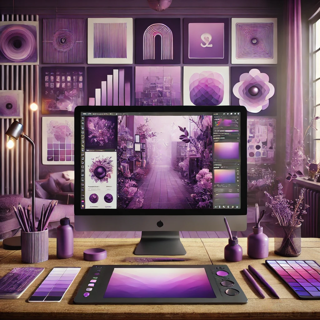
Purple is one of the most captivating colors in the spectrum, making it a favorite among digital creatives. Its rich, versatile tones evoke a sense of mystery, creativity, and luxury, making it perfect for design projects ranging from websites to social media graphics. Whether you're a graphic designer, photographer, or content creator, incorporating purple color schemes into your work can elevate your designs and leave a lasting impression. In this article, we'll explore the best ways to use purple in digital projects, share inspiring color palettes, and provide actionable tips to help you get started.

The Power of Purple in Digital Design
Purple is often associated with creativity, wisdom, and luxury. It stands out from other colors due to its ability to balance warm and cool undertones, making it a versatile choice for any project. Digital creatives love purple because it can convey a variety of moods depending on the shades and combinations used.
For example:
- Light Purples like lavender and lilac are soothing and calming, often used in wellness or beauty brands.
- Deep Purples like plum and eggplant exude richness and sophistication, ideal for luxury brands or bold statements.
- Bright Purples like violet and magenta add energy and playfulness, making them perfect for social media graphics or creative campaigns.
Purple's unique ability to connect with both emotion and intellect makes it an excellent choice for digital design.
Inspiring Purple Color Palettes for Digital Creatives
Dreamy Lavender
- Lavender (#E6E6FA)
- Soft Pink (#FFC0CB)
- Sage Green (#B2D8B6)
- Cream (#FFFDD0)
This palette is perfect for projects that require a soft, ethereal vibe. Use it for lifestyle blogs, wellness apps, or dreamy Instagram posts.
Luxury Amethyst
- Amethyst (#9966CC)
- Gold (#FFD700)
- Deep Charcoal (#333333)
- Ivory (#FFFFF0)
Ideal for high-end brands, this combination of deep purple and gold oozes sophistication and elegance. It's great for designing logos, websites, or luxury product packaging.
Modern Violet
- Violet (#8A2BE2)
- Cyan (#00FFFF)
- Magenta (#FF00FF)
- Midnight Blue (#191970)
A bold and vibrant palette for tech startups, fashion brands, or music-related projects. The vivid contrast ensures your designs stand out.
Rustic Plum
- Plum (#DDA0DD)
- Burnt Orange (#CC5500)
- Olive Green (#556B2F)
- Taupe (#D2B48C)
This earthy palette works well for digital creatives focused on organic or nature-inspired themes. Use it for eco-friendly brands or rustic photography edits.
Galactic Gradient
- Deep Purple (#4B0082)
- Neon Pink (#FF1493)
- Electric Blue (#7DF9FF)
- Black (#000000)
Perfect for futuristic designs, sci-fi themes, or gaming websites. This gradient-inspired palette adds depth and energy to digital artworks.
Applications of Purple in Digital Design
Purple color schemes can be used across a wide range of digital projects. Here's how digital creatives can apply purple effectively:
- Web Design: Purple is an excellent choice for websites that want to stand out or evoke a specific emotional response.
- Social Media Graphics: Purple grabs attention and works well with contrasting colors like yellow or teal.
- Branding and Logos: Brands often use purple to convey luxury, creativity, or uniqueness.
- Digital Art and Photography: Purple can add drama or mystery to your pieces.
- App and UI Design: Purple's calming and innovative qualities make it ideal for user interfaces.
Tips for Using Purple in Digital Design
To make the most out of purple color schemes, keep these tips in mind:
- Choose the Right Shade for Your Project.
- Balance Purple with Complementary Colors.
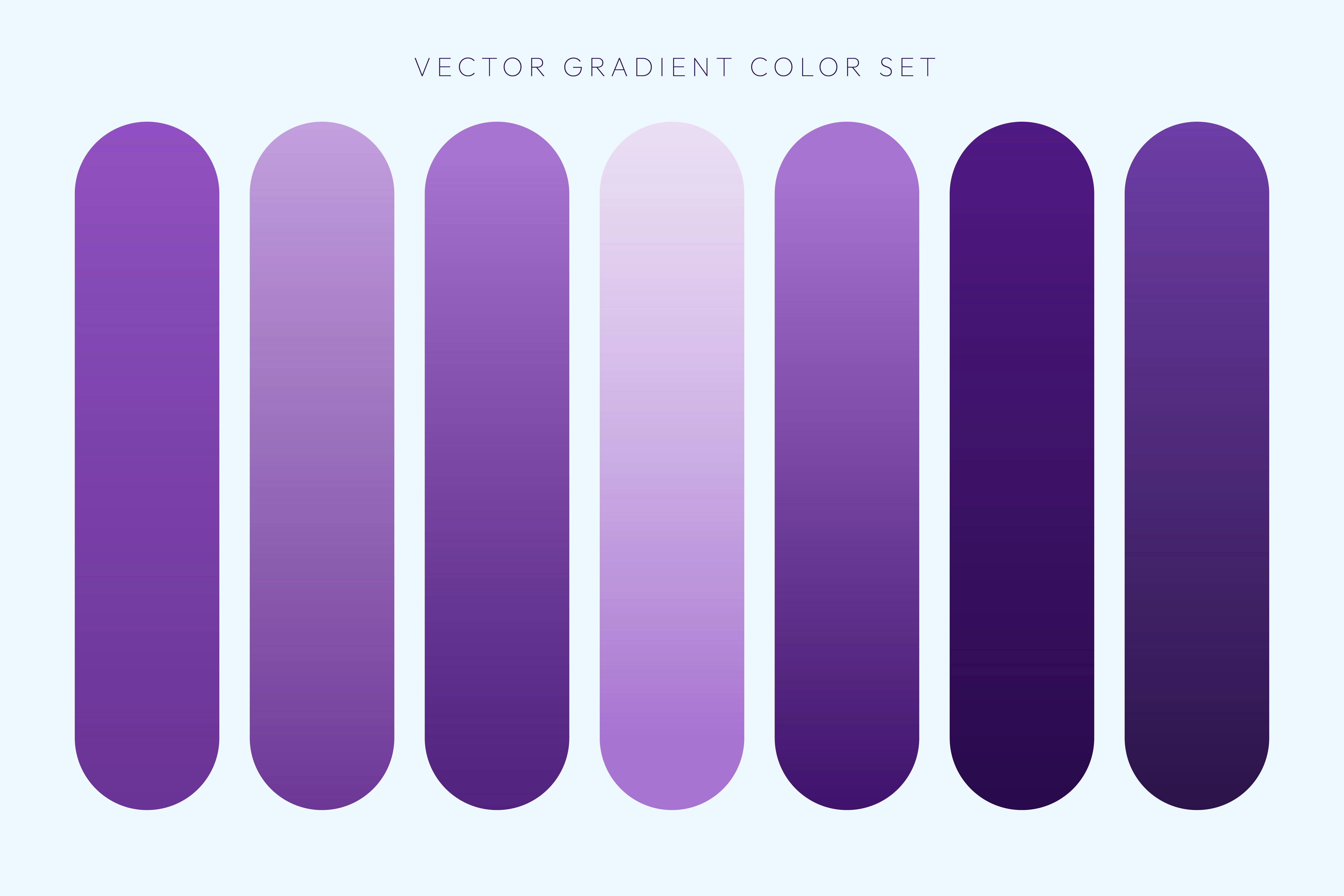
- Experiment with Gradients.
- Keep Accessibility in Mind.
- Use Purple Sparingly.
Why Digital Creatives Should Embrace Purple
Purple isn't just a beautiful color—it's a powerful tool for digital creatives. It allows you to evoke emotion, capture attention, and express creativity in unique ways. From soothing lavender tones to bold, electric violets, purple offers endless possibilities for experimentation.
The Psychology Behind Purple: Why It Works
Purple is a color that speaks to the soul. Its profound psychological impact stems from its unique position on the color spectrum, blending the stability of blue with the energy of red. This duality gives purple its versatile emotional resonance, making it a powerful tool in design and marketing. Let’s dive into the psychological underpinnings of purple and understand why it works so effectively.

Historical Significance of Purple
Purple has been associated with royalty, power, and wealth for centuries. In ancient times, purple dye was rare and expensive, made from the mucus of sea snails. This exclusivity meant only the elite could afford it, embedding the color with connotations of luxury and prestige. Today, while purple is accessible to all, its regal undertones remain intact, offering brands an opportunity to evoke a sense of sophistication and status.
Cultural Interpretations of Purple
Purple’s meaning varies across cultures, adding to its richness.
- In Western cultures, it often symbolizes creativity, mystery, and spirituality.
- In Japan, purple represents wealth and nobility, while in Thailand, it is linked to mourning for widows.
- In India, purple is sometimes associated with the divine and introspection.
This cultural flexibility allows purple to be tailored to specific audiences, making it a universally adaptable choice in global campaigns.
Emotional Impact of Purple Shades
The emotional tone of purple shifts dramatically based on its shade and intensity:
- Deep Purples (e.g., royal purple): Connote power, ambition, and luxury.
- Soft Purples (e.g., lavender, lilac): Evoke calmness, romance, and nostalgia.
- Bright Purples (e.g., violet): Spark creativity, playfulness, and energy.
Designers can strategically use these variations to align with a brand’s core message or the intended emotional response.
Purple in Color Theory
In the realm of color theory, purple occupies a unique position between warm and cool tones, making it a versatile choice for pairing.
- Complementary Colors: Yellow works as purple's complementary counterpart, creating high-contrast visuals that command attention.
- Analogous Colors: Neighboring hues like blue and pink can produce harmonious, soft palettes.
- Triadic Combinations: Pairing purple with green and orange adds a playful vibrancy to designs.
Understanding these combinations enables marketers and designers to harness the full potential of purple in their work.
Why Purple Resonates with Audiences
Purple works because it connects deeply with human emotions and aspirations:
- It inspires creativity, making it a favorite for artistic and innovative brands.
- It evokes trust and sophistication, appealing to audiences seeking quality and authenticity.
- It feels unique, helping brands stand out in crowded markets.
Whether it's used subtly or boldly, purple has the power to elevate a brand's perception and leave a lasting impression.
By understanding the psychology of purple, designers and marketers can use this remarkable color to its fullest potential. From crafting compelling brand identities to creating emotional connections, purple continues to be a magical choice in the world of design and marketing.
Purple’s Role in Different Industries
1. Fashion and Beauty:
Purple is synonymous with innovation and elegance in the fashion world. Designers use it to create bold statements or delicate accents, while beauty brands utilize shades of purple color palette to evoke creativity and individuality.
2. Technology and Innovation:
Tech companies often adopt purple to highlight innovation and forward-thinking. Brands like Yahoo and Twitch leverage purple’s creative tone to stand out in a competitive digital landscape.
3. Food and Beverages:
While uncommon in food branding, purple creates a sense of intrigue and premium quality when used strategically. Think of Cadbury’s iconic purple packaging, which immediately signals indulgence and richness.
Exploring Purple Color Palettes
Shades of Purple Color Palette
This palette includes variations like plum, violet, and lavender, each with its unique emotional appeal. Brands often mix these shades to create a dynamic visual identity that feels both cohesive and versatile.
Purple Grey Color Palette
The subdued elegance of purple grey is perfect for minimalist designs. It’s often used in industries like interior design and luxury goods to create a sophisticated, understated vibe.
Purple Pink Color Scheme
Blending the energy of pink with the mystique of purple, this scheme is playful yet refined. It’s a favorite in the beauty industry for targeting younger, trend-conscious demographics.
Purple with Other Color Combinations
Purple’s versatility shines when paired with contrasting or complementary colors. The purple and green palette, for example, brings nature-inspired vibrancy, while purple and gold evoke opulence.
Purple in Social Media and Website Design
Purple has carved its niche in the digital space. Social media platforms and websites use purple to create memorable visual experiences. For instance:
- Call-to-Action Buttons: Purple buttons stand out while remaining aesthetically pleasing.
- Backgrounds: Subtle gradients with purple tones can create depth and intrigue.
- Logos: Companies like Twitch use purple to reinforce their brand identity and appeal to creative communities.
Purple in Traditional and Digital Marketing
Traditional Marketing:
From billboards to product packaging, purple’s boldness ensures visibility. Luxury brands often use it to signal exclusivity and high value.
Digital Marketing:
Purple is a digital chameleon. It works seamlessly in ad campaigns, social media posts, and email marketing. Its ability to evoke emotion makes it a powerful tool for storytelling and brand recall.
How Purple Color Schemes Enhance Brand Identity and Recognition
Incorporating purple into your website design can significantly influence how your brand is perceived and remembered. Known for its association with creativity, luxury, and spirituality, purple is a powerful color that can evoke trust, elegance, and uniqueness. Let’s explore how this versatile hue can enhance your brand identity and recognition.

The Psychology Behind Purple in Branding
Purple is deeply rooted in symbolism. Throughout history, it has been associated with royalty, wealth, and wisdom due to the rarity and expense of purple dye in ancient times. Modern psychology suggests that purple sparks feelings of creativity, imagination, and sophistication. By aligning with these emotions, brands that use purple can build a strong connection with their audience.
Key psychological effects of purple in branding:
- Trust and Quality: Purple conveys reliability and high standards, making it a preferred choice for premium products and services.
- Creativity and Imagination: Creative brands use purple to inspire innovation and originality.
- Calm and Balance: The blend of calming blue and energetic red in purple creates a harmonious effect, perfect for brands seeking to evoke balance.
Purple Color Schemes in Building Brand Identity
A brand's identity reflects its values, vision, and personality. Purple color schemes add a unique edge to branding by showcasing distinct attributes. For example:
- Luxury and Elegance: High-end brands like Cadbury and Hallmark leverage rich shades of purple to emphasize exclusivity.
- Spirituality and Mindfulness: Wellness brands often use lavender tones to suggest tranquility and healing.
- Innovation and Futurism: Tech companies incorporate purple to highlight innovation and forward-thinking.
Why Purple Stands Out for Brand Recognition
Brand recognition is the ability of your audience to identify your brand among competitors. A well-executed purple color scheme can help brands achieve this through:
- Memorability: Purple is less commonly used in branding, giving your brand a distinctive presence.
- Consistency: Consistently using purple across logos, websites, and promotional materials creates a cohesive visual identity.
- Versatility: Purple pairs well with a range of colors, making it adaptable for various industries.
How to Effectively Use Purple in Website Design
When applying purple to your website, consider the following tips for maximum impact:
- Choose the Right Shade: Dark purples like plum exude luxury, while lighter shades like lavender suggest calmness. Select a shade that aligns with your brand values.
- Pair with Complementary Colors: Purple works beautifully with neutral tones (white, black, or gray) or accent colors like gold and green for an eye-catching look.
- Use Purple Strategically: Highlight key elements such as call-to-action buttons, navigation menus, or banners with purple to guide users' attention.
- Focus on Readability: Ensure text is easily readable by balancing purple backgrounds with contrasting font colors.
Examples of Brands Successfully Using Purple
FedEx (Express Division): The brand uses purple to convey trust and efficiency in its logo, reinforcing its professional image.
Yahoo!: This tech giant uses purple to stand out in the competitive digital landscape while promoting creativity and reliability.
Cadbury: Known for its iconic purple packaging, Cadbury exemplifies how color can build a luxurious, timeless brand identity.
The Role of Purple in Modern Design Trends
Purple has seen a resurgence in popularity, especially with the rise of gradients and dynamic designs. Many brands now incorporate purple into their digital presence to stay trendy and relevant.
- Gradients: Vibrant purple gradients are widely used in websites, logos, and social media to add depth and dimension.
- Dark Mode: Purple stands out in dark mode interfaces, making it a popular choice for modern app and web designs.
Case Studies: Purple’s Impact in Branding
1. Cadbury:
The iconic purple wrapper is synonymous with luxury and indulgence. The brand’s consistent use of the shade has made it instantly recognizable worldwide.
2. FedEx:
Combining purple with orange, FedEx uses the color to communicate dependability and forward-thinking, resonating with its global audience.
3. Twitch:
As a platform for gamers and creatives, Twitch’s purple identity reflects its innovative and inclusive community.
Conclusion: Embracing Purple Color Schemes
Purple color schemes are a treasure trove of creativity and impact. Whether you’re designing a brand logo, curating a social media campaign, or developing a product, purple’s versatility and emotional depth can elevate your project. From the harmonious purple grey color palette to the bold purple pink color scheme, there’s a shade and combination for every story.
Harness the power of purple, and watch your designs and campaigns come alive with elegance and emotion.
