Exploring Blue Color Schemes in Design and Branding
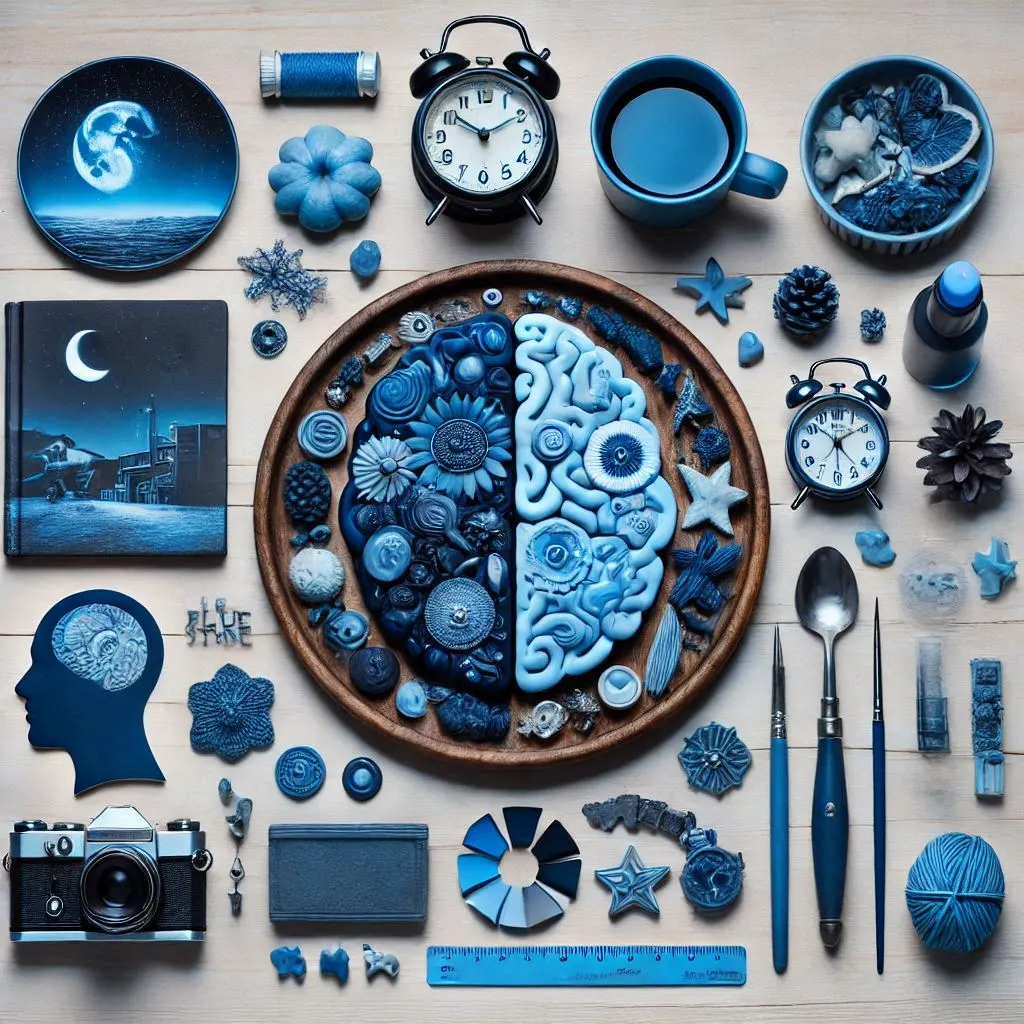
Blue color schemes have been a staple in design for centuries, favored for their soothing, calming, and versatile qualities. Whether used in websites, product packaging, or digital marketing materials, blue remains one of the most widely used colors across various industries. In this article, we will delve deep into the world of blue color schemes, explore the psychology behind the color, and provide insights into how different industries, from tech to fashion, have successfully utilized blue in their designs.
Understanding the Blue Color Schemes
Blue, with its serene and cool undertones, often evokes a sense of trust, tranquility, and professionalism. The mood and tone of blue can vary depending on its shade. Lighter blues, like sky blue or baby blue, bring about feelings of calm and peace, while deeper shades, such as navy or midnight blue, can convey authority, sophistication, and stability. When paired with other colors, blue can create harmonious, dynamic, or contrasting designs that suit a wide array of applications.
The Psychology of Blue: Tone and Mood
The tone of blue color schemes is powerful in setting the mood for a design. Blue tends to communicate a sense of reliability and trust, making it a go-to color in corporate branding. It’s a color that’s often associated with calmness, intelligence, and stability, which is why many financial institutions, tech companies, and healthcare brands incorporate blue in their color palettes.

In digital marketing, blue is frequently chosen for its positive psychological impact. It’s known to help people feel at ease, making them more receptive to a call-to-action or message. Whether in email marketing campaigns or website design, blue is the perfect hue for promoting a sense of security and confidence.
Different Industries and the Use of Blue Color Schemes
The use of blue color schemes spans a variety of industries, each benefiting from the psychological effects of the color. Below are some examples of how industries have integrated blue into their branding and design strategies:
- Technology and Corporate Sectors: Many tech companies, such as IBM, Intel, and Dell, use blue in their logos and branding. Blue communicates trust and dependability, which is crucial when selling products and services that require customer confidence. The color scheme of blue also evokes a sense of professionalism, making it ideal for business-focused organizations.
- Healthcare: In healthcare, blue is often used for its calming and therapeutic effects. Hospitals, clinics, and wellness brands use blue to create an environment of serenity and healing. Light blue tones are particularly popular in medical branding as they instill a sense of cleanliness and safety.
- Food and Beverage: Although less common, blue has begun making its way into food and beverage marketing. Brands like Pepsi and Nestlé incorporate various blue color palettes in their packaging and advertisements. Blue is often paired with white or red to create a sense of freshness and approachability.
- Fashion and Retail: Fashion brands, especially those that want to appear luxurious or reliable, often use darker shades of blue. Blue, in this context, signifies elegance and high-class appeal. Brands like Levi’s use blue in their denim products to evoke nostalgia and a sense of durability.
Exploring Popular Blue Color Palettes and Combinations
When working with blue color schemes, designers often explore various color combinations to create the perfect look. Here are some of the most popular blue color palettes and combinations:
- Websites with Blue Color Schemes: Websites designed with blue color schemes often feature a balanced use of lighter blues for backgrounds, complemented by darker blues for headers and call-to-action buttons. A white-blue color scheme is common on corporate and professional websites to create a clean, modern aesthetic.
- Web Design Blue Color Schemes: In web design, blue is commonly used for navigation bars, footers, and buttons. Blue is also a frequent color choice for text links, as it stands out against lighter backgrounds and provides easy readability.
- Red Blue Green Color Scheme: Combining blue with red and green can create a vibrant, energetic color scheme. This triadic color palette works well in playful and dynamic designs, often used in advertising and product packaging.
- White Blue Color Scheme: A white-blue color scheme is ideal for clean, minimalist designs. This combination is perfect for brands that want to appear professional and accessible. It’s often used in tech websites, online portfolios, and health-related products.
- Blue Orange Pink Color Scheme: A more unconventional combination, the blue-orange-pink color scheme is lively and bold. This palette works well in fashion and lifestyle marketing, where a fresh, youthful energy is desired.
- Color Palette Blue Red: The blue-red color palette creates a striking contrast, with blue providing calmness and red offering warmth and excitement. This combination is often used for branding related to sports, entertainment, and activism.
The Best Color Combinations for Blue: What Colors Go Best with Blue?
When creating a color palette featuring blue, it’s important to consider which colors suit blue the best. Below are some popular color combinations for blue:

- Neutral Colors: Shades of gray, white, and black pair well with blue and are frequently used in corporate branding and web design.
- Contrasting Colors: Yellow and orange are complementary to blue, creating a dynamic contrast that grabs attention.
- Earthy Tones: Colors like brown, green, and beige provide a natural, grounded contrast to blue, making them ideal for environmental and organic product brands.
Color Combinations for Blue: Exploring Options
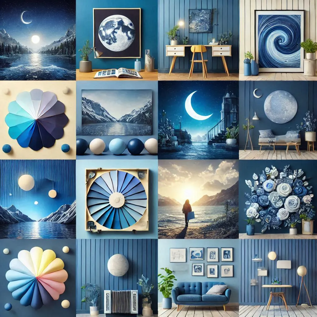
Creating a blue color palette involves not just pairing it with other colors but also considering different shades of blue itself. Here are a few palettes to inspire you:
Blue Color Families
- Bright Blue Palette: Includes shades like sky blue, electric blue, and deep sky blue.
- Soft Blue Palette: Features pastel blues, powder blue, and periwinkle.
- Rich Blue Palette: Incorporates deep blues, navy, and sapphire shades.
Blue Color Families
Blue Color Families
What Colors Go Well with Blue ?
Blue is a versatile color that pairs well with a wide range of colors, offering a variety of looks depending on the specific shade of blue and the colors chosen. Below are a few colors that go well with blue:
White
A classic pairing with blue, creating a fresh, clean, and calm aesthetic. White enhances the coolness of blue, making it look more vibrant and crisp.
Gray
A neutral that complements blue by balancing its intensity. Gray tones can tone down the brightness of blue, making it suitable for both professional and casual settings.
Yellow
The complementary color to blue, yellow provides a bold contrast. The warm tones of yellow bring a lively, energetic touch that makes blue feel more dynamic.
Green
Green, especially shades like mint, teal, or sage, can evoke a peaceful, nature-inspired palette when combined with blue. These colors together create a serene, calming vibe.
Pink
Soft pinks or blush tones with blue create a charming, gentle look. This combination often feels soft and playful, with a modern appeal.
Orange
As the complementary color to blue on the color wheel, orange can create a bold and striking contrast. While this combo can be intense, it's a popular choice for energetic, creative designs.
Beige or Tan
Earthy tones like beige or tan pair nicely with blue, particularly navy or darker blues. This combination feels grounded and sophisticated.
Purple
Blue and purple can blend harmoniously, creating a cool-toned palette that can range from calm to bold, depending on the specific shades chosen.
Red
Red and blue together create a high-energy combination, often used in patriotic or bold designs. This pairing demands attention and conveys strength.
What Are the 6 Colors of Blue?
Blue is a broad color category, with many shades ranging from light to dark. The six popular shades of blue include:
Sky Blue
A pale, soft blue that evokes the lightness and tranquility of a clear sky. Sky blue is often used in calm and serene designs.
Royal Blue
A rich, vibrant blue that is often associated with nobility, luxury, and elegance. Royal blue is bold yet refined and is frequently used in formal settings.
Navy Blue
A dark, deep shade of blue, often seen as professional, sophisticated, and timeless. Navy is frequently used in corporate settings and formal wear.
Cobalt Blue
A bright, vivid blue with a slightly greenish tint, cobalt blue is often associated with creativity and energy. It’s a popular choice in art and design.
Turquoise Blue
A blend of blue and green, turquoise is a tropical, calming shade. It’s often used in beach-themed designs and products.
Teal
A dark blue-green shade, teal is a deeper and more muted version of turquoise. It has a sophisticated, balanced look, and is commonly used in both home decor and fashion.
What Is the Perfect Pair for Blue?
The perfect pair for blue largely depends on the context and the tone you wish to set. However, a universally effective pairing is blue and white. This combination has a timeless quality, evoking a sense of freshness and calmness. It works in various contexts, from nautical themes to corporate designs and minimalist interiors.
Alternatively, blue and yellow can create a striking and energetic contrast. While blue brings calmness, yellow adds warmth and vibrancy, making this pairing ideal for bold, creative designs or marketing campaigns.
What Is the Three-Color Scheme of Blue?
A three-color scheme, also known as a triadic color scheme, involves using three colors that are evenly spaced around the color wheel. For blue, this can create a dynamic, balanced, and vibrant palette. Here’s an example of a three-color scheme using blue:
Blue
The base color, providing a cool, calming tone.
Red
A complementary color, which introduces warmth and creates contrast.
Yellow
The third color in the triadic scheme, adding a bright, energetic element.
This triadic scheme balances the coolness of blue with the warmth of red and yellow, making it ideal for designs that need vibrancy, contrast, and harmony.
Alternatively, if you're working with a different variation of blue (e.g., teal or navy), the triadic colors will shift, creating different effects, but the principles of contrast and balance remain.
If you're wondering, "which color suits on blue background?" consider using contrasting hues such as white, yellow, or even light pastel shades for readability and aesthetic balance.
The Role of Blue Color Schemes in Social Media and Websites
In the digital world, blue color schemes are a powerful tool for building brand identity and attracting attention. Social media platforms like Facebook and Twitter are prime examples of how blue can be used to create user-friendly interfaces that encourage engagement. Blue’s calming and trustworthy qualities make it an ideal color for social media sites where communication and trust are paramount.
On websites, blue is frequently used for buttons and calls to action. This is because blue is one of the most clickable colors, often resulting in higher conversion rates. The color is perceived as friendly and non-threatening, which encourages users to take the desired action, such as making a purchase or signing up for a newsletter.
Blue Color Schemes in Traditional and Digital Marketing
Blue has been used effectively in both traditional and digital marketing strategies. In traditional marketing, blue is often seen in print ads, billboards, and TV commercials. The color’s versatility makes it suitable for a wide range of industries, from technology to healthcare.
In digital marketing, blue is used extensively in website design, email marketing, and social media campaigns. Marketers often use blue to create a sense of trust and familiarity with potential customers, which is crucial in the competitive online marketplace. Whether used in email newsletters or banner ads, blue remains a color of choice for fostering customer loyalty.
Case Studies: How Brands Have Successfully Used Blue for Branding and Marketing
Let’s take a look at some well-known brands and how they have leveraged blue color schemes in their branding:
- Pepsi: Pepsi has famously used blue in its logo and packaging for decades. The brand’s blue color palette communicates refreshment and reliability, making it instantly recognizable across the globe.
- Facebook: Facebook’s iconic blue design is integral to its brand identity. The social media giant uses blue to foster a sense of trust and belonging, helping users feel comfortable interacting on the platform.
- IBM: Known as "Big Blue," IBM uses blue to represent its authority and expertise in the tech industry. The color is synonymous with reliability and professionalism, which resonates well with the company’s business-focused audience.
- Visa: Visa uses blue to evoke trust and security in financial transactions. The use of blue in their branding helps the company appear dependable and stable, crucial traits for a financial institution.
- Twitter: Twitter’s use of blue in its interface and logo is designed to be calming and approachable. This helps users feel at ease while interacting on the platform.
Conclusion
Blue color schemes are an essential component of design and branding, offering versatility, trust, and calmness across various industries. Whether in websites, social media platforms, or traditional marketing, blue has proven to be a powerful tool for creating a positive, engaging experience for customers. By understanding the psychology behind blue and experimenting with different color palettes, brands can use blue to enhance their visual identity and connect with their audience on a deeper level.
